19 Human-Centered AI
Lecture 18
Based on Lecture 18 of CS231n, Stanford University, Spring 2025, given by Fei-Fei Li.
19.1 What the field was trying to match
The course ends where it began, with the human visual system, but asking a different question about it. Section 2.1 used human vision as evidence that the problem is hard: a person watching a rapid sequence of never-before-seen images can still spot a target in one of them, and can separate an animal from a non-animal within about 150 milliseconds of the image appearing (Thorpe, Fize and Marlot, 1996). That was offered as a benchmark to be reached. The closing lecture treats the same fact as a specification that has now largely been met, and asks what the specification was for.
Two things converged to meet it, and they are worth separating because only one of them is usually named. The first is the familiar triple of data, compute and learned representations, which arrived together around 2012 and which Section 2.9 covers. The second is the source of the problems themselves. Categorisation, attention, scene understanding, the distinction between recognising an object and understanding a situation — none of these were posed by engineers looking for tractable benchmarks. They came from psychology and neuroscience, which had spent a century establishing that these are separable capacities in the first place. The traffic still runs both ways: vision models are now used as instruments for studying biological vision, and the questions that biological vision raises continue to supply the field with problems it would not otherwise have thought to pose.
That framing sets up the rest of the lecture, which is organised as three questions rather than three techniques. Can we build machines that see what people see? Can we build machines that see what people cannot? And — the question that turns out to carry the weight — can we build machines that see what people want seen? The first is a matter of capability, and it is substantially answered. The second and third are not questions about capability at all, and most of this chapter is about why.
19.2 Seeing what no person could
Human visual competence is uneven in a specific way: it is excellent at the level of categories that mattered for survival and social life, and poor below that level. Almost anyone can identify a bird; almost nobody can name the species. There are on the order of ten thousand bird species and, since the 1970s, thousands of distinguishable car models once make, model and year are all counted. This is the regime of fine-grained categorisation, and it is one of the few places where a vision model can be straightforwardly superhuman, because the human baseline is close to untrained.
The lecture is candid that the problem is not solved. Error rates on fine-grained bird classification climb steadily as the label becomes more specific — coarse taxonomic levels are easy and the species level is where the errors concentrate — and the problem has drifted out of fashion during the shift of attention towards multimodal language models without having been finished.
What makes it worth more than a note about accuracy is what fine-grained recognition becomes when it is pointed at a large enough collection of images. A classifier for car make, model and year, run over some 50 million Google Street View images from 200 American cities, recovers the demographic composition of neighbourhoods: income, education level, race, and voting patterns all correlate strongly with what is parked on the street (Gebru et al., 2017). No person and no feasible team of people could conduct that survey. The census does it every ten years at enormous expense; this does it from imagery already collected for another purpose.
The pivot buried in that result is the one the rest of the chapter turns on. A model used this way is no longer a component inside a product — it is a measuring instrument, and the standards that apply to instruments are not the standards that apply to products. When a classifier that is 92 % accurate sits behind a photo-tagging feature, the remaining 8 % is an annoyance distributed across users. When the same classifier is an instrument, its errors are not noise: they are measurement bias, they are structured, they correlate with exactly the demographic variables being measured, and they propagate into whatever conclusion the measurement supports. The question stops being how often the model is right and becomes what its being wrong is systematically a function of.
19.3 Where human vision fails
Before the lecture turns to what machines get wrong, it spends time on what people get wrong, and the two failures it picks are of genuinely different kinds.
The first is capacity. Reading the word red is automatic, and naming the ink colour it is printed in is not, so a list of colour words printed in mismatched inks is slow and effortful to work through — the Stroop effect. In the same family, two versions of a photograph alternating with a brief blank between them can differ in something as large as a vehicle’s engine, and observers hunt for many seconds before finding it. Change blindness of this kind is not a defect of the eye; it is a consequence of attention being a scarce resource that has to be pointed somewhere, so that what is not attended to is substantially not represented.
The second is systematic misperception. In Adelson’s checkerboard, two squares printed at identical luminance appear obviously different, and — this is the part that matters — they continue to appear different after the illusion has been demonstrated, with the proof sitting in front of you. The visual system is not reporting the light arriving at the retina. It is reporting its best inference about surface reflectance given assumptions about illumination, shadow and the physics of the scene, and those assumptions are wired deep enough that knowing about them changes nothing.
These two failures point in opposite directions, and the lecture’s remaining sections follow one each. Limited attention is a capacity problem, and a machine that does not tire is a genuine remedy for it — that thread runs into the clinic in Section 19.6. Systematic misperception is not a capacity problem, and no amount of additional machine attention fixes it, because the bias is in the inference rather than in the sampling. Bias of that second kind is what the lecture means when it says that human bias — inherited from evolution, from social experience, and from whatever data a person happens to have encountered — becomes harmful at the point where it makes a system unfair to some group of people.
That sentence is where this chapter has to slow down, because it is the load-bearing claim of the lecture and it is left undefined.
19.4 What “unfair” would have to mean
The lecture’s concrete example is face analysis, and the canonical measurement behind it is Gender Shades, which evaluated three commercial gender classifiers on a benchmark constructed to be balanced across skin tone and gender. The headline is a disparity rather than an average: error rates reached 34.7 % on darker-skinned women, against a worst case of 0.8 % on lighter-skinned men. The lecture’s reading is that the field went from not noticing this to taking it seriously, which is true and is a real achievement of the last decade.
But suppose you accept the finding and set out to fix it. What, precisely, is the target? “Make the system fair” is not yet a specification, and the moment it is made into one, a difficulty appears that no amount of attention or engineering effort removes.
Everything follows from one object. Fix a group of people and a binary decision — flag or do not flag — made about each of them, and record the outcome against the truth in a two-by-two table.
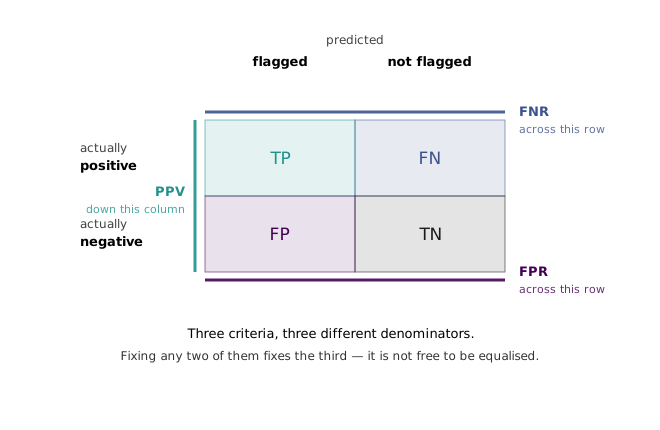
Write for the prevalence of the condition in the group, that is, the fraction of its members for whom the truth is positive. Three quantities can be read off the table, and each corresponds to something a reasonable person means by fairness.
The first is the positive predictive value, : among the people the system flagged, the fraction who genuinely were positive. Requiring it to be equal across groups is the demand that a flag mean the same thing whoever it is attached to. A decision-maker who cannot assume this has an explicit incentive to discount the score for members of one group, which is discrimination reintroduced at the point of use. In the fairness literature this is the coarse form of calibration, sometimes called test fairness.
The second is the false negative rate, : among people who genuinely were positive, the fraction the system missed. Equalising it across groups is balance for the positive class.
The third is the false positive rate, : among people who genuinely were not, the fraction wrongly flagged. Equalising it is balance for the negative class, and it is the criterion the Gender Shades style of audit is closest to, since it asks whether the burden of the system’s mistakes falls evenly.
Each is defensible. Each is what somebody means. The difficulty is that they are three ratios built from the same four cells, so they cannot be set independently. Writing the predictive value out in terms of the other quantities,
and solving for the false positive rate gives a relation due to Chouldechova (2017):
This is worth being clear about: Equation 19.2 is not a statistical result, an approximation, or a claim about any particular model. It is an algebraic identity on the four cells, and it holds for every two-by-two table whatever produced it. The generator for this chapter checks it against direct cell ratios over 28,561 integer tables and finds the worst disagreement to be , which is floating-point noise.
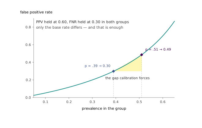
Now take two groups that differ in prevalence and ask for all three criteria at once. Equal predictive value and equal false negative rate mean the last two factors of Equation 19.2 are shared, so the false positive rates stand in the ratio of the odds of the two prevalences:
The third criterion is therefore not available to be chosen. It has already been determined by the first two together with facts about the world that the model does not control, and it takes the value the model wanted only when .
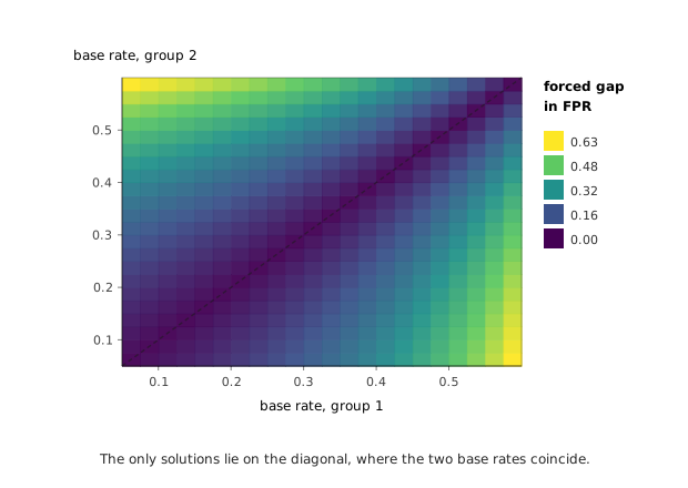
The general statement, for real-valued risk scores rather than binary flags, is due to Kleinberg, Mullainathan and Raghavan (2016). In their formulation the three conditions are calibration within groups, balance for the negative class, and balance for the positive class, with the balance conditions stated as equality of the average score assigned to the negative and positive members of each group. Their Theorem 1.1 is that any instance admitting all three must either allow perfect prediction — every individual’s outcome known with certainty in advance — or have equal base rates across groups. They also prove an approximate version, which closes the obvious escape route: satisfying the three conditions even approximately forces the instance to be approximately one of those two degenerate cases. There is no useful middle ground where a little unfairness on each axis buys a solution.
Sweeping the residual across pairs of base rates shows the shape of that result directly.
The clearest illustration is not synthetic. Chouldechova analyses the COMPAS recidivism score using the Broward County data released by ProPublica, where the two-year recidivism rate is 51 % among Black defendants against 39 % among White defendants. ProPublica’s finding was that the score’s error rates diverged sharply by race — a false positive rate of 45 % against 23 %, and a false negative rate running the other way at 28 % against 48 %. The instrument’s developers replied that the score was calibrated. Both parties were correct, and Equation 19.2 is why.
Taking each group’s published prevalence and false negative rate and computing the predictive value that must follow gives 0.625 and 0.591 — near enough equal to substantiate the developers’ claim. Running the relation in the other direction is the more interesting check: assume the score is exactly calibrated at the average of those two values, use nothing but each group’s prevalence and false negative rate, and predict what the false positive rates have to be. The answer is 48 % and 21 %, against published values of 45 % and 23 %. The error-rate gap that the dispute was about is recovered to within about three points from the base rates alone, without any access to the model, its training data, or the error rates themselves.
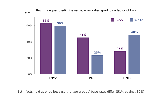
One caveat belongs here rather than in a footnote, because it is easy to overstate this result. Equation 19.3 predicts a false positive ratio equal to the odds ratio of the base rates, which is 1.63, whereas the published ratio is 1.96. The two do not have to agree, because Equation 19.3 assumes the false negative rates are equal across groups and in COMPAS they are conspicuously not — 28 % against 48 %. The prediction quoted above uses each group’s own false negative rate and is the honest version; the odds ratio alone would be the answer to a different question.
Two conclusions follow, and they pull in opposite directions, which is why both need stating.
The first is that a substantial part of what gets reported as algorithmic bias is not a defect that better engineering removes. When two populations differ in the base rate of the thing being predicted, and the predictor is anything short of perfect, the disparities are forced. Demanding that a vendor eliminate all of them at once is demanding something that provably does not exist, and a system audited against one criterion can be made to look scandalous by an audit against another without anything about it having changed.
The second is that this is not a defence of the Gender Shades numbers, and reading it as one inverts the argument. The theorem constrains how near to equality the three criteria can jointly be pushed; it says nothing that would license a forty-fold gap in error rate between demographic groups on a task where the label is a property of the image alone. That gap came from training and evaluation sets in which darker-skinned women were scarce, and it narrowed once it was measured, which is precisely the improvement the lecture is pointing at. The impossibility result and the audit are addressed to different failures: the audit catches the disparities that were nobody’s necessity, and the theorem tells you where to stop expecting the audit to be satisfiable.
What survives is that “fair” is not a property a model can be certified to have. It resolves into several incompatible properties, and choosing which of them a given deployment owes the people it is applied to is a question about consequences — whether a false flag or a missed case does more harm here, and to whom — which no amount of accuracy answers. The lecture is right that attention to the problem has grown. Attention produced the measurements; it cannot produce a joint solution that does not exist.
19.5 Designing for what must not be seen
There is a second sense in which a system can fail to see something, and here failure is the goal. A camera placed in a hospital room or a private home to watch for a fall, a missed medication or a hand not washed is, by construction, a camera pointed at people in the least guarded parts of their lives. The requirement is not to see less. It is to see one specific thing and nothing else.
The obvious responses treat this as a post-processing problem: blur the image, mask out faces and bodies, reduce the dimensionality of what is stored, keep the data on the device through federated learning, or encrypt it. Some of these are genuinely useful, and the ones that operate on the transmission of data rather than its content — keeping it local, encrypting it in flight — are the least compromised, because they do not degrade the signal at all.
The ones that degrade the image, though, run into a structural obstacle that the lecture states plainly and that deserves to be taken seriously as a design constraint. What identifies a person and what reveals their activity are not separable channels in a photograph. Blur an image until the face is unrecoverable and you have usually blurred it past the point where the difference between reaching for a glass and reaching for a pill bottle survives. The privacy dial and the utility dial are, for naive degradations, the same dial.
The work the lecture singles out attacks that by moving the degradation upstream of the sensor. In PrivHAR, the optics themselves are a learned component: the lens is parameterised, and its parameters are optimised jointly with the recognition network, against an adversary trying to recover identity from whatever the lens produces. The optimisation is pushed towards a lens whose images support action recognition while defeating face recognition, and because the distortion is physical, it happens before anything is digitised.
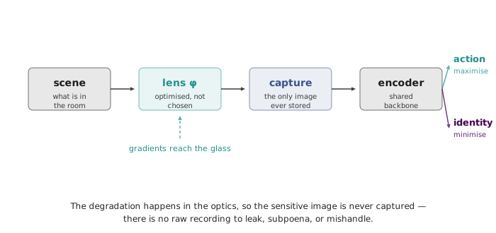
The consequence is a different kind of guarantee from the usual one. Software that blurs faces is a promise about what a system does with the sensitive image it holds, and that promise can be broken by a configuration error, a software update, a subpoena, or a breach. A lens that never forms the sharp image makes the sensitive recording not exist, which is not a policy that can be revoked. That is what makes the approach interesting well beyond the specific accuracy numbers it reports: it converts a promise into a physical fact, and it is a rare instance of a privacy property being enforced by the hardware budget rather than by an audit.
The general lesson the lecture draws from this half of the talk is that the same capability cuts both ways. A model that extends perception can extend it past the point people would consent to; a model trained on human judgements inherits human biases and, applied at scale, amplifies them rather than averaging them out. Neither is a reason to stop building. Both are reasons that the design question — what should this system be able to see, and what should it be constitutionally unable to see — has to be asked while the system is being specified, because it is very difficult to retrofit.
19.6 The clinic and the base rate
The strongest case in the lecture for machine perception is the one where the human failure being remedied is the capacity failure from Section 19.3 rather than the bias failure. Attention is finite and shifts; a sensor’s does not.
The setting is what the lecture calls the dark spaces of healthcare — operating rooms, patient rooms, homes — where consequential things happen continuously and are observed only intermittently, and where the shortfall is not expertise but coverage (Haque, Milstein and Fei-Fei, 2020). The pressure is demographic and will intensify: as life expectancy rises the population needing sustained care grows, while the working-age population available to provide it does not, and health systems already report chronic shortages of nurses. The argument for automation here is unusually clean, because the labour it would substitute for does not exist to be displaced.
The applications follow the same pattern. Hand hygiene compliance matters because hospital-acquired infections are a leading cause of inpatient death — the widely cited estimate is around 99,000 deaths a year in the United States, several times the toll of road accidents (Klevens et al., 2007) — and germs move between rooms on hands. Auditing compliance by having humans watch is unaffordable and, given the fatigue and attention limits already discussed, unreliable; proximity badges answer a different question, since standing near a dispenser is not using it. Depth sensors that resolve people as silhouettes rather than images, feeding an action classifier, answer the actual question while capturing much less than a camera would — the same instinct as Section 19.5, implemented more cheaply (Singh et al., 2020). In intensive care, where getting patients mobilised on schedule is a determinant of how quickly they leave, similar sensors track transfers between bed and chair (Yeung et al., 2019). In homes, the same apparatus is aimed at fall detection, sleep and mobility patterns, and early signs of infection.
The lecture also opens this section with a striking claim: that medical error is the third leading cause of death in the United States. That figure comes from an analysis by Makary and Daniel (2016), which extrapolated death rates from four earlier studies covering 2000 to 2008 across all US hospitalisations in 2013 to reach 251,454 deaths a year. It is worth reporting accurately, because the estimate has been substantially criticised — the source studies were not designed to be generalised to the whole hospitalised population, several covered only Medicare patients, and the extrapolation applied their rates to every admission including uncomplicated childbirth. The direction of the claim is not seriously disputed: preventable harm in hospitals is common and badly measured. The specific ranking is an artefact of a rough calculation, and repeating it as an established statistic overstates what is known.
That distinction matters more than it looks, because measurement is exactly where these systems either earn their place or fail, and the arithmetic that decides it is the same table as Section 19.4 — now read inside one group rather than across two.
Take the lecture’s own operating-room example. Instruments, sponges and needles are counted by hand against a checklist, and a discrepancy stops the operation while the item is searched for, with the pause averaging close to an hour of additional anaesthesia, exposure and bleeding. An automatic count is an obviously attractive target. But retained surgical items are, thankfully, extremely rare — the largest series put the rate at roughly one per 5,500 operations. Write for that prevalence. Then the probability that a raised alarm is real is
where sensitivity is the fraction of genuine retentions caught and specificity the fraction of clean operations correctly left alone. The behaviour of Equation 19.4 at small is the whole problem. A detector at 99 % sensitivity and 99 % specificity — figures that would be reported as excellent — yields a predictive value of 0.018 at this prevalence: about 57 stoppages for every genuine retained item. At 99.9 % specificity it is 0.15, still roughly seven false stoppages per real one. Reaching an even chance that an alarm is real requires specificity above 99.98 %, and reaching 90 % requires 99.998 %.
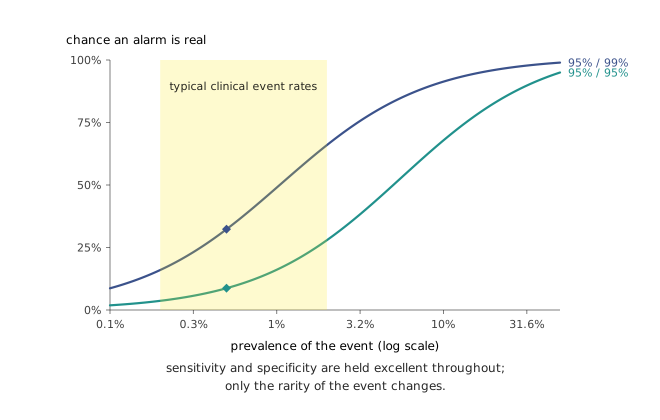
None of this is an argument against the application, and it is not a claim that these systems do not work. It is a statement about which number decides whether they work. Sensitivity is what a demonstration shows off and what a benchmark rewards; at low prevalence it is nearly irrelevant to whether the system is usable, because the denominator of Equation 19.4 is dominated by false positives drawn from the overwhelming majority of cases where nothing is wrong. A system that stops one operation in a hundred to look for an item that is present once in 5,500 will be switched off within a month, and it will be switched off by people who are behaving entirely rationally. This is the same phenomenon that makes screening programmes for rare diseases difficult, and it sorts the applications in this section into two groups rather than condemning all of them. Falls, infection onset and retained instruments are rare relative to the number of opportunities to alarm about them, and all inherit the problem. Hand hygiene does not, and the contrast is instructive: the event being classified is whether a dispenser was used on a room entry, which happens on a large fraction of entries rather than once in thousands, so the reported operating point of 92.1 % sensitivity at 98.3 % specificity lands in the flat left-hand region of Equation 19.4 rather than the collapsing one. The system works partly because the question was posed at a favourable base rate — a design decision, and one that is easier to make deliberately than to recover from later.
The connection to Section 19.4 is not an analogy. It is the same four cells. Read across two groups they force a choice between incompatible notions of fairness; read against a low base rate they force attention onto the metric that a benchmark is least likely to be reporting. In both cases the failure mode is the same: a number that summarises the model gets mistaken for a number that describes the deployment.
19.7 Letting people choose the task
Sensors gather information and cannot act on it, which is where the lecture turns to embodied systems — and where it poses the question that gives the chapter its title, in its sharpest form. How such systems are trained is the subject of the previous chapter. The question here is prior to that: who decides what they should be trained to do?
The default answer is that researchers decide, and the default has a recognisable signature. Benchmark tasks tend to be the ones that are convenient to simulate, easy to score, and salient to graduate students, which is why so much of the field converges on laundry and dishes. This is not obviously wrong, but it is unexamined, and it quietly determines what the technology will be good at years before anyone outside the field is consulted.
BEHAVIOR-1K inverts the order of operations. Its task list was assembled by starting from government labour and time-use surveys to enumerate thousands of everyday activities, then asking around 1,400 people which of them they would actually want a robot’s help with, and ranking by the answers. The resulting thousand tasks are the ones people said they wanted done, and they are supported by fifty scanned real environments — homes, offices, restaurants, shops — and thousands of object assets annotated with the physical properties the activities depend on, such as articulation, deformability and temperature.
What makes the survey interesting is not the top of the ranking, which is unsurprising: cleaning, in most of its forms, is work people are glad to hand over. It is the bottom. People did not want a robot to buy a wedding ring, to play a sport on their behalf, to open a gift, or to prepare an infant’s food — and in several of these cases the task is well within reach technically. The refusal is not about feasibility. Some activities carry their meaning in the fact that a person did them, and automating them destroys the thing they were for.
That is a finding no amount of capability research would have produced, because it is not a fact about robots. It is the same structural point as Section 19.4 and Section 19.6 arriving from a third direction: the objective is not derivable from the system. What to optimise, which errors to tolerate, what must remain unseen, and now which tasks are wanted at all — each is a question whose answer has to come from the people affected, and each is a question a benchmark will silently answer by default if nobody asks it.
19.8 Augmentation
The lecture closes on labour, and refuses both of the available slogans. Denying that these systems will change what work looks like is not credible; every general-purpose technology has reorganised labour markets, sometimes with severe and unevenly distributed costs. But the specific prediction that has dominated public discussion — that physical work goes first — has not been how the past few years have run. The measurable disruption so far has landed on white-collar work: software, analysis, writing, the office tasks that were assumed to be furthest from automation.
Against that, the sectors this lecture spends most of its time on are ones where the shortage is real and structural. Elder care, nursing and chronic disease management are short of people now, and demographic arithmetic makes them shorter every year. Machine perception aimed at those settings is not competing with a workforce; it is compensating for one that does not exist and cannot be conjured, and the honest framing of the surgical count, the hygiene monitor and the mobility tracker is that each returns some attention to people who have too little of it.
That is the argument for augmentation over replacement, and the reason it is more than a comforting phrase is that every section of this chapter has run into the same wall from a different side. The fairness criteria could not all be satisfied, so someone has to choose which one the decision owes its subjects. The rare-event detector could not be evaluated by accuracy, so someone has to decide what rate of false alarm a ward will tolerate and for what benefit. The privacy-preserving camera could not be specified without deciding what it must be unable to see. The task benchmark could not be assembled without asking which tasks people want performed. In none of these cases was the missing ingredient a better model, and in every one of them the missing ingredient was a human judgement about consequences that the metric could not supply.
That is what the phrase is pointing at. Not that machines should be kept subordinate for reassurance, but that the systems in this chapter are all incomplete in the same specific way: each computes something, and none of them can tell you what it should have been computing. Which is where a course on how to build them has to stop, and where the responsibility for pointing them somewhere begins.